Teal Temptation: A Love Affair Between Blue and Green
What Is Teal?
Teal is a medium-toned blue-green colour, often described as being more blue than green. It sits somewhere between blue, green, and turquoise on the colour wheel. Depending on who you ask, you may hear it referred to as blue-green, aqua, aquamarine, or even ultramarine.
Like many of these “in-between” shades, teal often gets lost in translation, ask any artist what they consider Teal and you’ll receive a variety of answers. It’s much like the elusive colour beige, another shade that can stir debate.
My Love-Hate Relationship with Beige
Speaking of beige, I’ve never been its biggest fan. I avoid it in my artwork whenever possible. That said, I’ve had to make peace with it. Why? Because teal and beige actually work beautifully together.
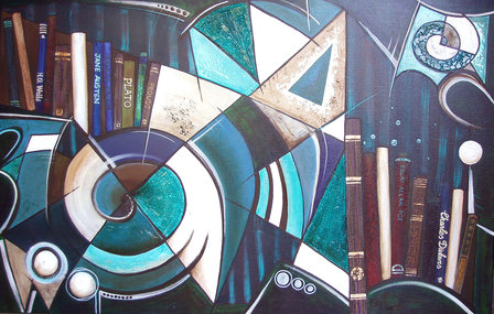
As someone who uses teal often, I’ve begrudgingly introduced beige into my palette. You’ll see this pairing in many of my paintngs, in the painting below titles Philosophy of Literature, I feel that it captures the calm elegance of teal with subtle undertones of beige to soften and balance the composition.
Teal: A Personal Colour Evolution
Teal is a colour I’ve grown to love. It might surprise those who know me—especially since I spent much of my life gravitating toward rich, warm colours like reds, ochres, and sienna. Shifting to the cool, serene hues of teal has been quite the transition. But now, teal has become a staple in both my artistic practice and personal surroundings.
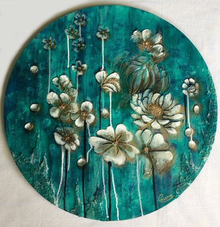
Teal and the Lagoon: A Natural Connection
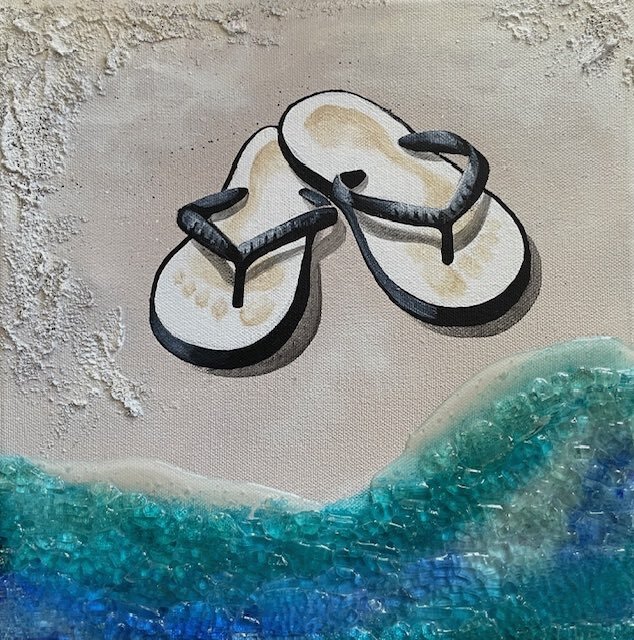
I use teal regularly in my artwork, especially in my jandals paintings like Back in Black, pictured below. My island paintings inspired by the stunning lagoon in Rarotonga, where I also sell some of my pieces in a local gallery. If you’ve ever visited, you’ll understand why this colour sneaks its way into my work, the lagoon’s captivating shades of turquoise and aquamarine are unforgettable.
Teal has become my way of bottling up those happy memories and transforming them into visual stories on canvas.
Teal in Interior Design
Outside of my studio, teal makes a frequent appearance in my home décor. It evokes a sense of calm and tranquillity that pairs perfectly with my love of silver accents. One of my paintings featuring this colour—Without Light Nothing Flowers—remains a firm favourite.
Teal or Turquoise? What’s the Difference?
Teal and turquoise are often used interchangeably, but they are not the same. Turquoise leans more toward green, and is also the name of a semi-precious mineral popular in jewellery. It’s a colour with rich cultural ties to the Middle East and American Southwest, often seen in traditional patterns, gemstones, and ornaments.
Teal Through the Ages
Teal had its heyday in the 1950s and 1960s, when it was a go-to colour in fashion and home décor. Today, with retro styles making a comeback, teal is enjoying a well-deserved resurgence. Darker shades of teal feel more sophisticated and formal, while lighter tones are playful and feminine.
The Psychology and Symbolism of Teal
Teal is associated with:
-
Calmness and serenity (like water)
-
Emotional balance
-
Sophistication and creativity
-
Clarity and communication
It’s a colour often used in branding and interior design for spaces meant to relax or refresh the mind.
Did You Know? Pink Is Teal’s Complimentary Colour
That’s right, pink sits opposite teal on the colour wheel, making it a perfect contrasting partner. Whether soft blush or bold magenta, pink brings out the vibrancy of teal in a way few other colours can.
How to Mix Teal
Teal is made by mixing blue (a primary colour) with green (a secondary colour). My personal recipe? A blend of Phthalo Turquoise and French Ultramarine Blue, with a tiny touch of Cadmium Red to tone it down.
This combination creates a rich, lagoon-like teal that works beautifully in seascapes. When painting tropical waters, I often enhance this mixture with Titanium White and hints of bright green to mimic that glowing, shallow-sea vibrancy.
Colour Combinations with Teal
Teal is a flexible colour that pairs well with a wide range of shades. Here are some of my favourite combinations:
Soft and Feminine
-
Teal + Lavender + Pale Pink
A dreamy, romantic palette perfect for whimsical or floral artworks.
Retro and Sparkly
-
Bright Teal + Silver + Shades of Pink
Channel that mid-century retro vibe with metallics and bold pastels.
Art Deco Drama
-
Teal + Black + White
Create bold contrast and timeless glamour—perfect for modern, graphic pieces.
Southwestern Warmth
-
Teal + Grey + Terra Cotta + Beige + Brown
This earthy palette gives your work a grounded, natural aesthetic.
Fresh and Sporty
-
Teal + Orange or Yellow
Great for pop art, energetic themes, or playful interiors.
Final Thoughts on Teal
Teal is more than just a colour, it’s a mood, a memory, a statement. It has the power to be peaceful or bold, playful or refined, and its versatility makes it a favourite among artists and designers alike. Whether you’re painting ocean scenes, retro portraits, or modern interiors, teal is a shade worth exploring.
Why Not Check Out Some Other Colours Too -
50 Powerful Shades Of Grey? The Thrilling Colours In Art
Beautiful Blue: The depth of Sea to the Sky and Beyond
In the Pink: Celebrating Valentines Passionate Colour
Shades of Purple: A Trip into the World of Royalty
Stunning Silver: The Best Metallic Colour with Class and Glamour
The Best of Black: The Mysterious and Luxurious Shade
The Gloriousness of Gold: Unleashing its Luxury and Passion
Yellow: The Happy Glowing Hue That Makes Warmth, and Inspiration
What Is The Colour Burgundy Or Claret, Colours Or Wines?
Whiter Shade of Pale: Exploring the Simplicity of White
Rich as Red: Exploring its Many Fiery Shades
Blazing with Energy: Embracing the Fiery Spirit of the Color Orange
Glorious Green: The Awesome Yet Envious Colour of Emeralds
And while you’re here - Touching on Colour Mixing
Posted: Wednesday 20 January 2010